1. Iris Data 탐색
* 내장된 데이터 셋에서 Iris 데이터를 로드
from sklearn import datasets
iris = datasets.load_iris()
* Iris = (Sepal Length, Sepal Width, Petal Length, Petal Width)
iris.data
* Target
iris.target
* Target_Name(0: setosa, 1: versicolor, 2: vriginica)
iris.target_names
* Sepal Scatter
# Sepal Scatter
sepal_length = iris.data[:, 0]
sepal_width = iris.data[:, 1]

species = iris.target

# Visulization
plt.figure()
plt.title('Iris Dataset - Sepal')
plt.scatter(sepal_length, sepal_width, c = species)
plt.xticks(())
plt.yticks(())

plt.xlabel('Sepal Length')
plt.ylabel('Sepal Width')

plt.show()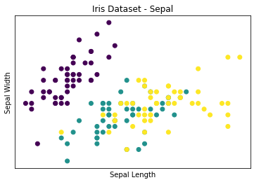
* Petal Scatter
# Petal Scatter
petal_length = iris.data[:, 2]
petal_width = iris.data[:, 3]

species = iris.target

# Visulization
plt.figure()
plt.title('Iris Dataset - Petal')
plt.scatter(petal_length, petal_width, c = species)
plt.xticks(())
plt.yticks(())

plt.xlabel('Petal Length')
plt.ylabel('Petal Width')

plt.show()
* Length Scatter
# Length Scatter
sepal_length = iris.data[:, 0]
petal_length = iris.data[:, 2]

species = iris.target

# Visulization
plt.figure()
plt.title('Iris Dataset - Length')
plt.scatter(sepal_length, petal_length, c = species)
plt.xticks(())
plt.yticks(())

plt.xlabel('Sepal Length')
plt.ylabel('Petal Length')

plt.show()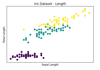
2. Linear Regression(1)
* Import
import numpy as np
import pandas as pd
import matplotlib.pyplot as plt
from sklearn import linear_model
* 임의의 다항함수를 만들고, 다항함수를 통해 데이터를 생성한 뒤, 생성한 데이터를 통해 다항함수를 예측
1) 목표 함수 생성
# 목표하는 함수
def f(x1, x2):
    return x1*4 + x2*-7 + 3
2) 데이터 생성
x1 = np.random.randint(0, 100, 3000)
x2 = np.random.randint(0, 100, 3000)

y = f(x1, x2)
3) 데이터를 통해 모델 예측
regr = linear_model.LinearRegression()

x = np.concatenate([x1[:, np.newaxis], x2[:, np.newaxis]], axis = 1)

# LinearRegression.fit(2차원 행렬, 2차원 행렬)
regr.fit(x, y[:, np.newaxis])

# 다항 함수의 계수
print('Coefficients: ', regr.coef_)

# 다항 함수의 절편
print('Intercpet: ', regr.intercept_)
4) 결과
- 기존: 4, -7 / 절편: 3
- 예측: 4, -7 / 절편: 3

* 같은 원리로 생성한 데이터에 노이즈를 추가하여 다항 함수 예측
1) 목표 함수 및 노이즈 추가 함수 생성
def random(x1, x2, x3, x4):
    return x1*0.5+x2*39-x3*0.5+x4+13


def add_noisy(y):
    for i in range(len(y)):
        noise = np.random.randint(0, 15)/100 * y[i]
        y[i] += noise if np.random.randint(0, 2) == 1 else - noise
2) 데이터 생성 및 노이즈 추가
x1 = np.random.randint(0, 100, 1000)
x2 = np.random.randint(0, 100, 1000)
x3 = np.random.randint(0, 100, 1000)
x4 = np.random.randint(0, 100, 1000)

y = random(x1, x2, x3, x4)

add_noisy(y)
3) 모델 생성 및 예측
regr2 = linear_model.LinearRegression()

x = np.concatenate([x1.reshape(-1, 1), x2.reshape(-1, 1), x3.reshape(-1, 1), x4.reshape(-1, 1)], axis = 1)

regr2.fit(x, y.reshape(-1, 1))

print('Coefficients: ', regr2.coef_)
print('Intercpet: ', regr2.intercept_)
4) 결과
- 기존: 0.5, 39, -0.5, 1 / 절편: 13
- 예측: 0.52, 38.55, -0.36, 1.06 / 절편: 11.27

5) 시각화
plt.plot(np.arange(1000), y, '.')
plt.plot(np.array([0, 1000]), np.array([y[0], y[999]]))

plt.show()
2. Linear Regression(2)
* Datasets에 내장된 diabetes를 활용한 Linear Regression 수행
diabetes = datasets.load_diabetes()

# 훈련 데이터, 검증 데이터 구분
x_train = diabetes.data[:-20]
y_train = diabetes.target[:-20]
x_test = diabetes.data[-20:]
y_test = diabetes.target[-20:]
* 모델 생성 및 학습
linear_diabetes = linear_model.LinearRegression()
linear_diabetes.fit(x_train, y_train)
* linear model의 계수, 절편 확인
# 계수
linear_diabetes.coef_

'''
array([ 3.03499549e-01, -2.37639315e+02,  5.10530605e+02,  3.27736980e+02,
       -8.14131709e+02,  4.92814588e+02,  1.02848452e+02,  1.84606489e+02,
        7.43519617e+02,  7.60951722e+01])
'''

# 절편
linear_diabetes.intercept_

'''
152.76430691633442
'''
* 예측&참 값
# 예측
linear_diabetes.predict(x_test)

'''
array([197.61846908, 155.43979328, 172.88665147, 111.53537279,
       164.80054784, 131.06954875, 259.12237761, 100.47935157,
       117.0601052 , 124.30503555, 218.36632793,  61.19831284,
       132.25046751, 120.3332925 ,  52.54458691, 194.03798088,
       102.57139702, 123.56604987, 211.0346317 ,  52.60335674])
'''

# 예측의 참 값
y_test

'''
array([233.,  91., 111., 152.,
		120.,  67., 310.,  94.,
        183.,  66., 173., 72.,
        49.,  64.,  48., 178.,
        104., 132., 220.,  57.])
'''
* 결정계수
# 결정계수
linear_diabetes.score(x_test, y_test)

# 0.5850753022690574
* 'Age' 칼럼을 대상으로 학습 및 시각화
x_train_age = x_train[:, 0].reshape(-1, 1)
x_test_age = x_test[:, 0].reshape(-1, 1)

# 모델 생성 및 학습
linear_diabetes_age = linear_model.LinearRegression()
linear_diabetes_age.fit(x_train_age, y_train)

# 예측
y = linear_diabetes_age.predict(x_test_age)

# 결정계수
linear_diabetes_age.score(x_test_age, y_test)
# -0.1327020163062087

# x_test_age, y_test 데이터 값
plt.scatter(x_test_age, y_test, color = 'red')

# x_test_age에 따른 선형 회귀 결과 출력
plt.plot(x_test_age, y, color = 'black')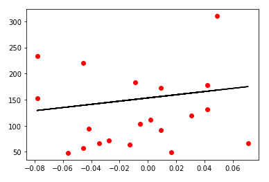
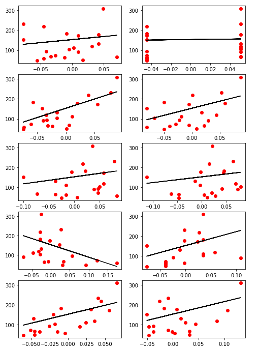
* 모든 칼럼 값 학습 후 비교
# 시각화 차트 분할
plt.figure(figsize=(8, 12))

for i in range(len(diabetes.feature_names)):
    x_train_tmp = x_train[:, i].reshape(-1, 1)
    x_test_tmp = x_test[:, i].reshape(-1, 1)
    linear_tmp = linear_model.LinearRegression()
    linear_tmp.fit(x_train_tmp, y_train)
    y = linear_tmp.predict(x_test_tmp)
    print(diabetes.feature_names[i], "'s Score: ", linear_tmp.score(x_test_tmp, y_test))
    plt.subplot(5, 2, i+1)

    plt.scatter(x_test_tmp, y_test, color = 'red')
    plt.plot(x_test_tmp, y, color = 'black')

'''
age 's Score:  -0.1327020163062087
sex 's Score:  -0.13883792137588857
bmi 's Score:  0.47257544798227136
bp 's Score:  0.15995117339547205
s1 's Score:  -0.16094176987655562
s2 's Score:  -0.15171870558112976
s3 's Score:  0.060610607792839555
s4 's Score:  -0.004070338973065413
s5 's Score:  0.3948984231023219
s6 's Score:  -0.08990371992812851
'''
3. PCA
* Import
from sklearn.decomposition import PCA
* Fit
PCA(주성분분석으로 줄일 크기).fit_transform( 데이터 )
x_pca = PCA(n_components = 3).fit_transform(iris.data)
* Visualization
from mpl_toolkits.mplot3d import Axes3D

fig = plt.figure()
ax = Axes3D(fig)
ax.set_title('Iris Dataset By PCA')
ax.scatter(x_pca[:, 0], x_pca[:, 1], x_pca[:, 2], c = species)
ax.set_xlabel('First Eigenvector')
ax.set_ylabel('Second Eigenvector')
ax.set_zlabel('Third Eigenvector')

ax.view_init(elev=20, azim=70)

# ax.w_xaxis.set_ticklabels(())
ax.xaxis.set_ticklabels(())

# ax.w_yaxis.set_ticklabels(())
ax.yaxis.set_ticklabels(())

# ax.w_zaxis.set_ticklabels(())
ax.zaxis.set_ticklabels(())


plt.show()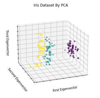
4. KNN(K-Nearest Neighbors)
* Import
from sklearn.neighbors import KNeighborsClassifier
* 데이터는 기존에 사용한 Iris 데이터를 활용한다.
x = iris.data

y = iris.target

i = np.random.permutation(len(iris.data))
i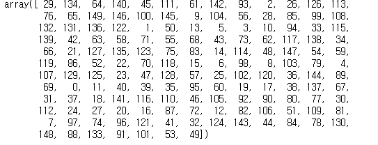
* 데이터 추출
# 훈련 데이터 무작위 140개, 검증 데이터 무작위 10개
x_train = x[i[:-10]]
y_train = y[i[:-10]]
x_test = x[i[-10:]]
y_test = y[i[-10:]]
* 모델 생성 및 훈련
knn = KNeighborsClassifier()
knn.fit(x_train, y_train)
* 검증 및 비교
# 학습한 knn에 테스트 데이터를 넣어 결과값을 확인해본다.
knn.predict(x_test)
y_test
# 두 결과가 동일한 것을 통해 학습이 잘 훈련된 것을 알 수 있다.
* Color Map을 활용한 시각화( Sepal Length, Sepal Width 군집화 & 시각화 )
# 영역별 시각화를 위해 Import
from matplotlib.colors import ListedColormap

iris = datasets.load_iris()
x = iris.data[:, :2] # Sepal Length, Sepal Width 칼럼
y = iris.target # 두 칼럼에 해당하는 꽃 종류(0, 1, 2)

# Colormap
cmap = ListedColormap(['#AAAAFF','#AAFFAA','#FFAAAA'])

# 전 좌표 상의 점을 knn에 입력하여 결과를 구분할 수 있게 한다.
s_len_min, s_len_max = x[:, 0].min() - 1, x[:, 0].max() + 1
s_wid_min, s_wid_max = x[:, 1].min() -1, x[:, 1].max() + 1

xx, yy = np.meshgrid(np.arange(s_len_min, s_len_max, 0.01), np.arange(s_wid_min, s_wid_max, 0.01))

# iris data를 통해 학습
knn2 = KNeighborsClassifier()
knn2.fit(x, y)
# 학습시킨 knn에 전 좌표를 대입한 결과를 반환
Z = knn.predict(np.c_[xx.ravel(), yy.ravel()])
# 전 좌표를 대입하여 해당 좌표가 꽃 3가지 종류 중 어느 종류일지 예측한 결과가 0, 1, 2 형태로 나오게 된다.
# array([1, 1, 1, ..., 2, 2, 2])
Z = Z.reshape(xx.shape) # reshape할 때 다른 객체의 형태를 참조할 수 있다.
# Z는 Species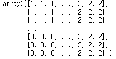
# vlsualization
plt.figure()
plt.pcolormesh(xx, yy, Z, cmap = cmap, shading = 'auto')
plt.show()
# 영역과 점 동시 시각화
# 영역
plt.figure()
plt.pcolormesh(xx, yy, Z, cmap = cmap, shading = 'auto')

# 점
plt.scatter(x[:, 0], x[:, 1], c = y)
plt.show()
예제)
- 4개 클래스를 가진 데이터 집합을 생성
- 각 클래스에 50개씩의 데이터 포함
- 시각화했을 때 각 그룹의 색상으로 구분
a = np.random.randint(0, 25, 100)
b = np.random.randint(25, 50, 100)
c = np.random.randint(50, 75, 100)
d = np.random.randint(75, 100, 100)

rand = a+b+c+d

result = np.array([0]*25 + [1]*25 + [2]*25 + [3]*25)

rand = np.c_[np.arange(0, 100), rand]

# 전 좌표 생성
xx, yy = np.meshgrid(np.arange(0,100, 0.5), np.arange(0, rand.max()+10, 0.5))

# 분류기 생성 및 학습
knn = KNeighborsClassifier()
knn.fit(rand, result)

# 학습한 분류기에 전 좌표 입력 후 결과 반환
Z = knn.predict(np.c_[xx.ravel(), yy.ravel()])
Z = Z.reshape(xx.shape)

# 시각화(scatter를 먼저하면 점이 보이지 않음)
plt.figure()

cmap = ListedColormap(['#AAAAFF','#AAFFAA','#FFAAAA', '#FFFFAA'])
plt.pcolormesh(xx, yy, Z, cmap = cmap, shading = 'auto')

plt.scatter(rand[:, 0], rand[:, 1], c = result)

plt.show()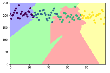
5. SVM(Support Vector Machines)
* Import and Data Create
from sklearn import svm

# data 생성
x1 = np.random.randint(5, 20, 20).reshape(-1, 2)
x2 = np.random.randint(10, 25, 20).reshape(-1, 2)

# 분포 확인
plt.scatter(x1[:, 0], x1[:, 1])
plt.scatter(x2[:, 0], x2[:, 1])

x = np.vstack((x1, x2))
y = [0]*10 + [1]*10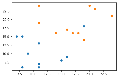
# 완성된 데이터 분포 확인
plt.scatter(x[:, 0], x[:, 1], c=y)
* Classfication
svc = svm.SVC(kernel = 'linear').fit(x, y)
# kernel 종류: 'linear', 'poly', 'rbf', 'sigmoid', 'precomputed'

xx, yy = np.mgrid[0:25:200j, 0:25:200j] # 0~4를 200등분
Z = svc.decision_function(np.c_[xx.ravel(), yy.ravel()])
# decision_function(): 결정경계로부터의 거리에 따라 각 지점을 양수/음수로 평가

Z = Z.reshape(xx.shape)

plt.contourf(xx, yy, Z, alpha=0.4)
# Z값이 음수/양수인지에 따라 영역별 표시
# (Z < 0) or (Z > 0) 이면 양수, 음수에 따라 2색으로 표시

plt.contour(xx,yy,Z, colors=['k'], linestyles=['-'],levels=[0])
# levels는 결정경계의 레벨(0은 결정경계의 중간)

plt.scatter(x[:, 0], x[:, 1], c=y)
6. K-Means
* 무작위 정수 100개를 산점도로 표시하고, 클러스터 수를 지정하여 K-Means 알고리즘으로 클러스터링한 후에 각 데이터를 클러스터별로 다른 색상으로 산점도로 표시해보시오. 특정한 점(데이터)가 어떤 클러스터에 속하는지 추정해보시오.
* Import
from sklearn.cluster import KMeans
# data create
x = np.arange(100)
y = np.random.randint(1, 101, 100)
X = np.c_[x.reshape(-1, 1), y.reshape(-1, 1)]

# model fit
k = 3
kmeans = KMeans(n_clusters = k)
kmeans = kmeans.fit(X)
labels = kmeans.predict(X)
centroids = kmeans.cluster_centers_

# centroids
print(centroids)

'''
[[78.58536585 42.04878049]
 [32.38235294 70.94117647]
 [25.08       22.12      ]]
'''

plt.scatter(x, y, c = labels)
plt.show()
'프로그래밍' 카테고리의 다른 글
| [R] R을 이용한 회귀분석 (0) | 2021.05.17 |
|---|---|
| [R] R을 이용한 상관분석 (0) | 2021.05.16 |
| [Python] Matplotlib 활용(3) (0) | 2021.05.13 |
| [Python] Matplotlib 활용(2) (0) | 2021.05.10 |
| [Python] Matplotlib 활용(1) (0) | 2021.05.09 |