반응형
14. Contour Map
dx = 0.01
dy = 0.01
x = np.arange(-2, 2, dx)
y = np.arange(-2, 2, dy)
X, Y = np.meshgrid(x, y)
def f(x, y):
    return (1-y**5+x**5)*np.exp(-x**2-y**2)
C = plt.contour(X, Y, f(X, Y),8, colors = 'black') # 등고선 그리기
plt.contourf(X, Y, f(X, Y), 8)
plt.clabel(C, inline = 1, fontsize=10)
plt.show()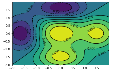
15. Polar Chart: 각도와 거리를 표현하는 차트
N = 10
theta = np.arange(0, 2*np.pi, 2*np.pi/N)
radii = np.random.randint(0, 10, N)
plt.axes([0.025, 0.025, 0.95, 0.95], polar = True)
bars = plt.bar(theta, radii, width = (2*np.pi/N), bottom = 0.0)
plt.show()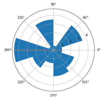
* 1년 동안의 여행객 수(월별)를 Polar Chart로 표현
traveler = np.random.randint(0, 100, 12)
theta = np.arange(0, 2*np.pi, 2*np.pi/12)
plt.axes([0.025, 0.025, 0.95, 0.95], polar = True)
colors = np.array(['lightgreen', 'darkred', 'navy', 'brown','violet', 'plum',
                   'yellow', 'darkgreen', 'magenta', 'lightblue', 'red', 'lightyellow'])
plt.bar(theta, traveler, width = (2*np.pi/12), bottom = 0.0, color = colors)
plt.title('월별 방문객 수')
plt.show()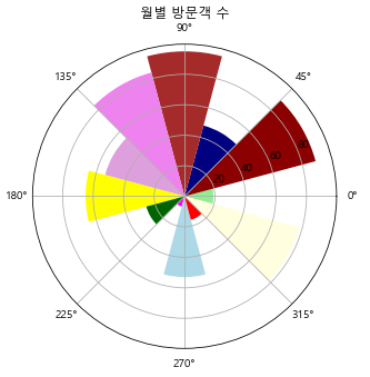
16. 3D 시각화
* Import
from mpl_toolkits.mplot3d import Axes3D
fig = plt.figure()
ax = Axes3D(fig)
X = np.arange(-2, 2, 0.1)
Y = np.arange(-2, 2, 0.1)
X, Y = np.meshgrid(X, Y)
ax.plot_surface(X, Y, f(X, Y), rstride = 1, cstride = 1)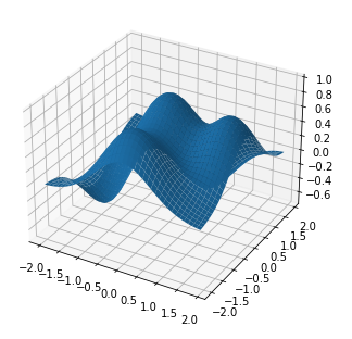
* 평면 만들기
fig = plt.figure()
ax = Axes3D(fig)
X = np.arange(-2, 2, 0.1)
Y = np.arange(-2, 2, 0.1)
Z = np.ones((len(X), len(Y)))
X, Y = np.meshgrid(X, Y)
ax.plot_surface(X, Y, Z, rstride = 1, cstride = 1)
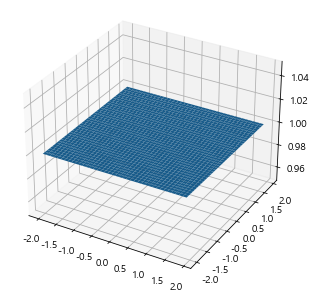
fig = plt.figure()
ax = Axes3D(fig)
X = np.arange(-2, 2, 0.1)
Y = np.arange(-2, 2, 0.1)
X, Y = np.meshgrid(X, Y)
ax.plot_surface(X, Y, X, rstride = 1, cstride = 1)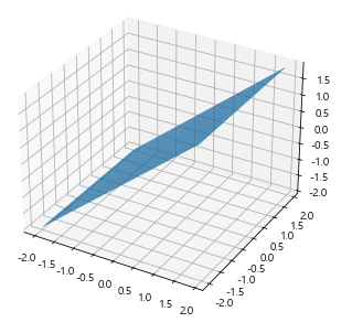
xs = np.random.randint(30,40,100)
ys = np.random.randint(20,30,100)
zs = np.random.randint(10,20,100)

xs2 = np.random.randint(50,60,100)
ys2 = np.random.randint(30,40,100)
zs2 = np.random.randint(10,20,100)

xs3 = np.random.randint(10,30,100)
ys3 = np.random.randint(40,50,100)
zs3 = np.random.randint(40,50,100)

fig = plt.figure()

ax = Axes3D(fig)

ax.scatter(xs,ys,zs)
ax.scatter(xs2,ys2,zs2,c='r',marker='^')
ax.scatter(xs3,ys3,zs3,c='g',marker='*')

ax.set_xlabel('X Label')
ax.set_ylabel('Y Label')
ax.set_zlabel('Z Label')

plt.show()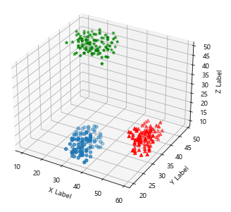
x = np.arange(10)
y = np.random.randint(0, 10, 10)
y2 = y + np.random.randint(0, 2, 10)
y3 = y2 + np.random.randint(0, 2, 10)
y4 = y3 + np.random.randint(0, 2, 10)

fig = plt.figure()
ax = Axes3D(fig)
ax.bar(x, y, 0, zdir='y')
ax.bar(x, y2, 10, zdir='y')
ax.bar(x, y3, 20, zdir='y')
ax.bar(x, y4, 30, zdir='y')

ax.set_xlabel('X Axis')
ax.set_xlabel('Y Axis')
ax.set_xlabel('Z Axis')
ax.view_init(elev=40)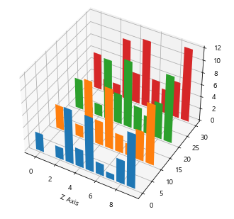
17. Multi-Panel Plot
fig = plt.figure()

# 차트가 그려질 공간의 원점을 변경
ax = fig.add_axes([0.1, 0.1, 0.8, 0.8]) # left, bottom, width, height
inner_ax = fig.add_axes([0, 0, 0.5, 0.5])
plt.show()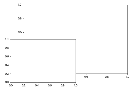
* 다중패널 3개에 각각 다른 차트 그리기(1. Bar Chart, 2. Scatter Chart, 3. Line Chart)
x = np.arange(10)
y1 = np.random.randint(0, 10, 10)
y2 = np.random.randn(10)

fig = plt.figure()
ax = fig.add_axes([0.1, 0.1, 0.9, 0.9])
inner_ax2 = fig.add_axes([0.7, 0.7, 0.25, 0.25])
inner_ax3 = fig.add_axes([0.2, 0.7, 0.25, 0.25])

ax.bar(x, y1)
inner_ax2.scatter(x, y2)
inner_ax3.plot(x, y1)

plt.show()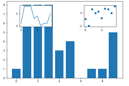
* 3행 3열의 차트 공간 설정
( 0행: 0~1컬럼
1행: 0컬럼
0행: 2컬럼
1행: 1~2컬럼
2행: 0~2컬럼)
gs = plt.GridSpec(3, 3)
fig = plt.figure(figsize = (6, 6))
a = fig.add_subplot(gs[0, :2])
b = fig.add_subplot(gs[0, 2:])
c = fig.add_subplot(gs[1, 0])
d = fig.add_subplot(gs[1, 1:3])
e = fig.add_subplot(gs[2, :])

x = np.arange(0, 1, 0.05)
y1 = np.exp(x)
y2 = np.exp(-x)
y3 = np.exp(x+2)
y4 = np.exp(x**3)
y5 = np.exp(-np.exp(-x))

a.plot(x, y1)
b.bar(x, y2)
c.barh(x, y3)
d.scatter(x, y4)
e.hist(y5)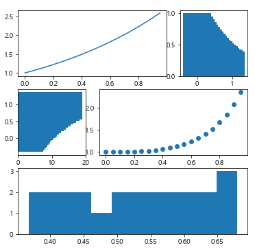
반응형
'프로그래밍' 카테고리의 다른 글
| [R] R을 이용한 상관분석 (0) | 2021.05.16 |
|---|---|
| [Python] Machine Learning(Linear Regression, PCA, KNN, SVM, Kmeans) (0) | 2021.05.16 |
| [Python] Matplotlib 활용(2) (0) | 2021.05.10 |
| [Python] Matplotlib 활용(1) (0) | 2021.05.09 |
| [Python] Data Aggregation (0) | 2021.05.09 |