반응형
8. set_major_locator(), set_major_formatter() 등
import matplotlib.dates as mdates
months = mdates.MonthLocator() # month 객체를 활용할 수 있음
days = mdates.DayLocator()
timeFormat = mdates.DateFormatter('%Y-%m')

fig, ax = plt.subplots()
plt.plot(events, sales)

ax.xaxis.set_major_locator(months)
ax.xaxis.set_major_formatter(timeFormat)
ax.xaxis.set_minor_locator(days)

plt.show()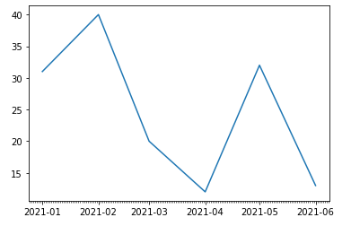
9. Numpy.pi()를 활용한 그래프
x = np.arange(-2*np.pi, 2*np.pi, 0.01)
y = np.sin(3*x)/x
plt.plot(x, y)
plt.show()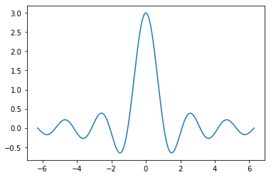
y2 = np.sin(2*x)/x
y3 = np.sin(x)/x
plt.plot(x, y, x, y2, x, y3)
plt.show()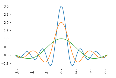
plt.plot(x, y, x, y2, x, y3)
plt.xticks([-2*np.pi, -np.pi, 0, np.pi, 2*np.pi])
plt.yticks([-1, 0, 1, 2, 3])

ax = plt.gca() # gca = get current axis

ax.spines['right'].set_color('none') # 오른쪽 테두리 X
ax.spines['top'].set_color('none') # 위쪽 테두리 X

# 기존 아래 테두리와 왼쪽 테두리를 0으로 set_position
ax.spines['bottom'].set_position(('data', 0))
ax.spines['left'].set_position(('data', 0))

# 주석 표기
plt.annotate(r'$\lim_{x\to 0}\frac{\sin(x)}{x} = 1$', xy=[0, 1],
     xycoords='data', xytext = [30, 30], fontsize = 16, textcoords='offset points')
# xy: 위치
# xytext: txy위치로부터 픽셀만큼 떨어진 위치에 표시(textcoords를 지정해야 올바르게 표현됨)

plt.show()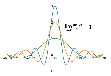
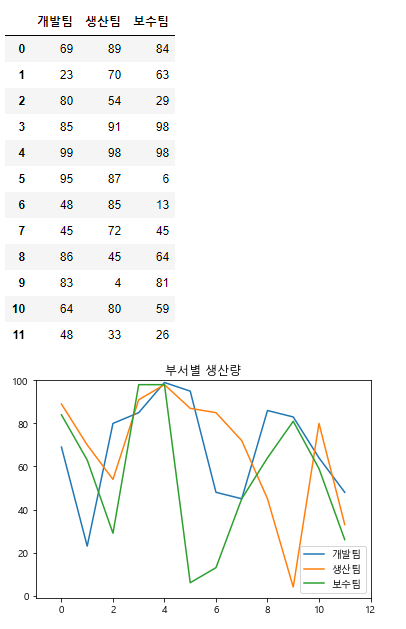
10. 한글 깨짐 방지 및 DataFrame 그래프로 변환
# 부서별 성과

data = {'개발팀': np.random.randint(0, 100, 12),
       '생산팀': np.random.randint(0, 100, 12),
       '보수팀': np.random.randint(0, 100, 12)}
df = pd.DataFrame(data)
display(df)
plt.axis([-1, 12, -1, 100])
plt.plot(df)

# 한글 깨짐 발생
plt.legend(data, loc = 0)
plt.title('부서별 생산량')

# 한글 깨짐 방지
plt.rc('font', family='Malgun Gothic')
plt.rcParams['axes.unicode_minus'] = False
11. plt.hist() - 히스토그램
* 1~100 사이의 무작위 정수 10000개를 추출하여 20개의 범주로 분류하여 각 범주의 빈도수를 표시
data = np.random.randint(1, 100, 10000)
plt.hist(data, bins = 20)
plt.show()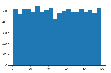
* 정수 10000개를 정규분포를 이루는 데이터로 추출하여 빈도수를 표시
data = np.random.normal(0, 5, 10000) # 평균 0, 표준편차 5
plt.hist(data, bins = 20)
plt.show()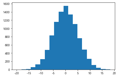
12. plt.bar() - 막대그래프
idx = [str(i)+'월' for i in np.arange(1, 13)]
values = np.random.randint(1, 10, 12)
plt.bar(idx, values)
plt.show()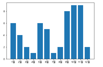
* (xerr, yerr 추가) 5개의 무작위 정수 그룹을 생성, 각 그룹에는 정수 50개의 정수 포함, 평균과 표준편차를 구하고
Bar Chart에 각 그룹의 평균과 표준편차를 표시(에러 바를 사용)
data = {'a': np.random.randint(0, 100, 50),
       'b': np.random.randint(0, 100, 50),
       'c': np.random.randint(0, 100, 50),
       'd': np.random.randint(0, 100, 50),
       'e': np.random.randint(0, 100, 50)}
me = [data[i].mean() for i in data]
std = [data[i].std() for i in data]
plt.bar(np.arange(5), me, yerr = std, error_kw = {'capsize': 6})
plt.show()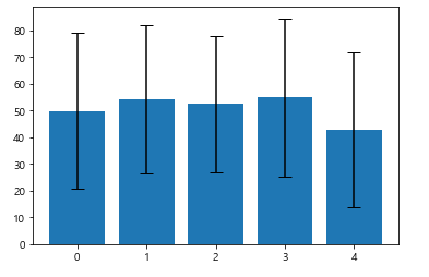
* Horizontal Bar Chart
plt.barh(np.arange(5), me, xerr = std, error_kw = {'capsize': 6})
plt.show()
* width 조절
width = 0.3
plt.bar(np.arange(5), me, width)
plt.bar(np.arange(5)+width, std, width)
plt.legend(('mean', 'std'), loc = 0)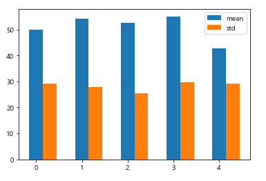
* 4개의 컬럼(봄, 여름, 가을, 겨울), 각 계절별로 5개의 무작위 정수를 추출하여 DF를 생성하고 Multiserial bar chart로 표현
data = {'봄': np.random.randint(0, 100, 5),
        '여름': np.random.randint(0, 100, 5),
        '가을': np.random.randint(0, 100, 5),
        '겨울': np.random.randint(0, 100, 5)
       }
df = pd.DataFrame(data)
df.plot(kind = 'bar', title = 'Seasons')
plt.show()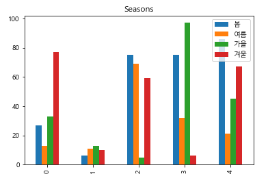
* Multiseries Stackec Bar Charts
ser1 = np.random.randint(0, 100, 5)
ser2 = np.random.randint(0, 100, 5)
ser3 = np.random.randint(0, 100, 5)
idx = np.arange(5)

plt.bar(idx, ser1)
plt.bar(idx, ser2, bottom = ser1)
plt.bar(idx, ser3, bottom = (ser1+ser2))
plt.legend(('봄', '여름', '가을'), loc = 0)
plt.xticks(idx, ['2016', '2017', '2018', '2019', '2020'])
plt.show()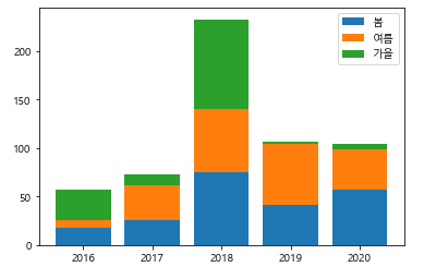
* Multiseries Stackec Bar Charts(Horizontal)
ser1 = np.random.randint(0, 100, 5)
ser2 = np.random.randint(0, 100, 5)
ser3 = np.random.randint(0, 100, 5)
idx = np.arange(5)

plt.barh(idx, ser1)
plt.barh(idx, ser2, left = ser1)
plt.barh(idx, ser3, left = (ser1+ser2))
plt.legend(('봄', '여름', '가을'), loc = 0)
plt.yticks(idx, ['2016', '2017', '2018', '2019', '2020'])

plt.show()
data = {'봄': np.random.randint(0, 100, 5),
        '여름': np.random.randint(0, 100, 5),
        '가을': np.random.randint(0, 100, 5),
        '겨울': np.random.randint(0, 100, 5)
       }
df = pd.DataFrame(data)
df.plot(kind = 'bar', title = 'Seasons', stacked=True)
plt.show()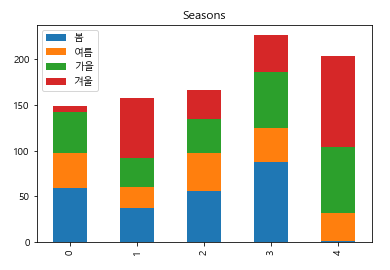
summer = np.random.randint(0, 100, 5)
winter = np.random.randint(0, 100, 5)

plt.xticks(())
plt.ylim([-115, 115])

idx = np.arange(5)

plt.bar(idx, summer, label = '여름')
plt.bar(idx, -winter, label = '겨울')

for x, y in zip(idx, summer):
    plt.text(x, y, f'{y}', ha = 'center', va = 'bottom')

for x, y in zip(idx, winter):
    plt.text(x, -y, f'{y}', ha = 'center', va = 'top')


plt.legend()
plt.show()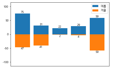
13. plt.pie()
labels = ['spring', 'summer', 'fall', 'winter']
values = np.random.randint(1, 10, 4)
colors = ['red', 'blue', 'yellow', 'green']
plt.pie(values, labels = labels, colors = colors, startangle=-90, autopct='%.1f%%')
plt.axis('equal')
plt.show()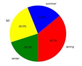
* 무작위 정수 5개를 추출하여 각 부서(3개)별 생산량을 정하고 DF 생성. 부서 중 한 개의 부서를 택하여 그 데이터를 pie chart로 표현.
data = {'개발팀': np.random.randint(0, 20, 5),
       '생산팀': np.random.randint(0, 20, 5),
       '보수팀': np.random.randint(0, 20, 5)}
df = pd.DataFrame(data)
df['개발팀'].plot(kind='pie', title = '개발팀 생산량')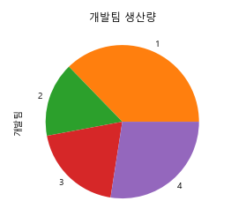
반응형
'프로그래밍' 카테고리의 다른 글
| [Python] Machine Learning(Linear Regression, PCA, KNN, SVM, Kmeans) (0) | 2021.05.16 |
|---|---|
| [Python] Matplotlib 활용(3) (0) | 2021.05.13 |
| [Python] Matplotlib 활용(1) (0) | 2021.05.09 |
| [Python] Data Aggregation (0) | 2021.05.09 |
| [Python] Data Manipulation (0) | 2021.05.07 |